Design: Between Function and Beauty
A well-known designer mocks a new logo, and thousands applaud. Only Abdullah asks the question no one answers: is beauty everything?
 Abdulaziz Almaqbali
Salem scrolled through a flood of tweets, then raised his head and laughed a laugh you could almost hear through the screen. He felt someone had to call all this noise to order, so he wrote: "Very ordinary work. Not worthy of a company like (...)!" He posted it and moved on to something else.
Forty-three minutes later, the tweet had collected fifty-eight retweets and thirty-one replies, all along the lines of "So true," "Honestly, shame on them," "My little brother designs better than this," and "Pay me a quarter of what they paid and I'd make them something better." Abdullah hesitated. He was wary of contradicting Salem, the well-known designer, but in the end he wrote: "Sorry, Salem, but is beauty everything?"
Salem never replied, and no one has answered Abdullah since.
That question stayed with me longer than the tweet did. Not because Salem was necessarily wrong (perhaps the work really was ordinary), but because no one in the entire thread asked: ordinary in what? In how it looks, or in what it is supposed to do?
The Difference Between Art and Design
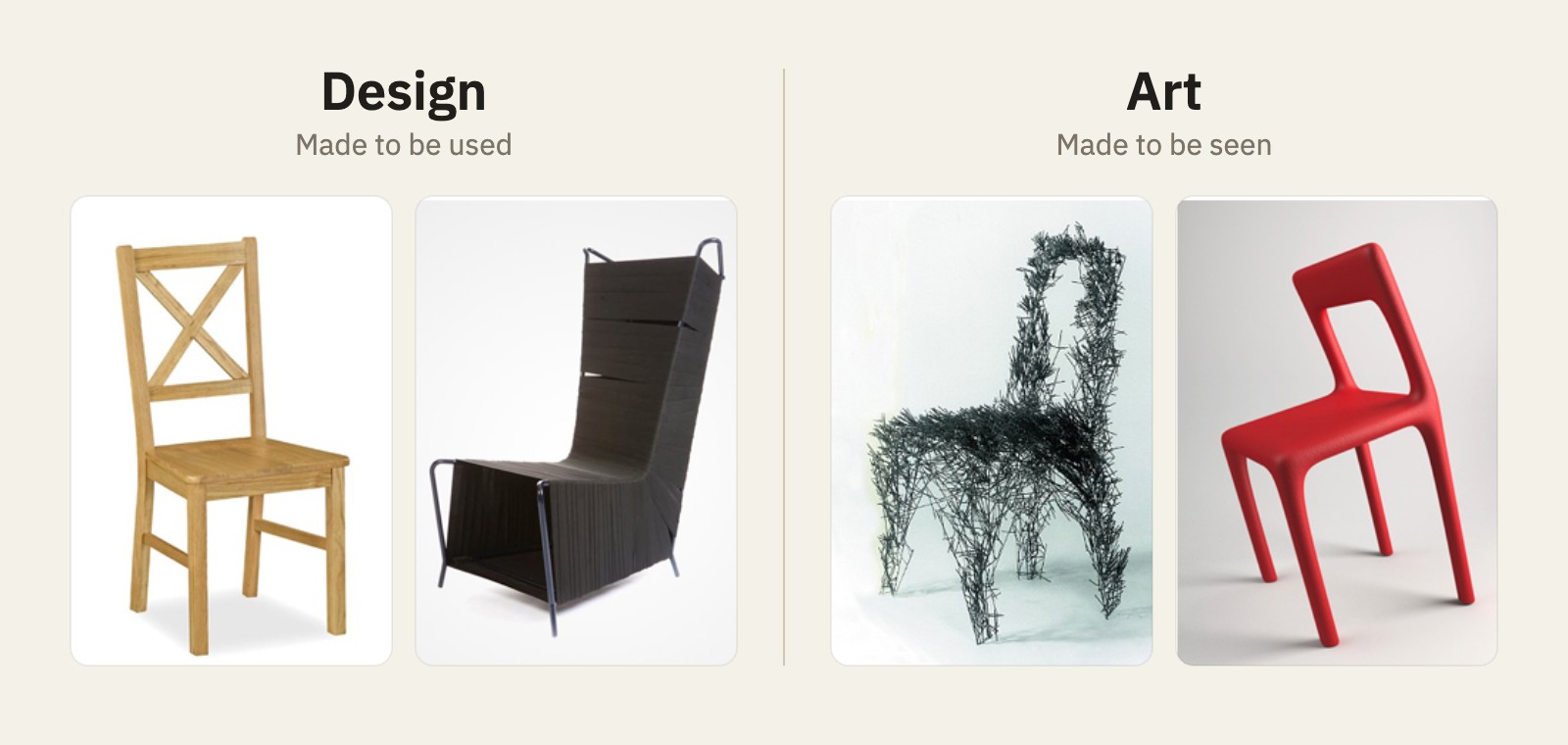
Critics once argued over whether art exists for its own sake or for society. From that whole debate, only one thing matters to me here: art used to be called the "fine arts," and its purpose was to nourish people with beauty. Then came industry, photography, and printing, followed by graphic design, identity, and advertising, and visual art gained a second purpose that sits beside beauty and sometimes competes with it: to perform a function. That is where the term "applied arts" came from, and that is where the confusion began, the one Salem and everyone who applauded him fell into.
An artist creates for himself first. An idea arrives and he pours it out, without asking anyone whether they will like it. A designer works for others. He keeps in front of him the person who will use the thing, their way of life, and what they need, and then does what is right for them, not what is right for himself. You buy a chair to sit on it. If the chair is a masterpiece that delights the eye but no one can sit on it, it is art, and it has its place in a gallery. It is not design.
Function Before Beauty: In Logos, Ads, and Places
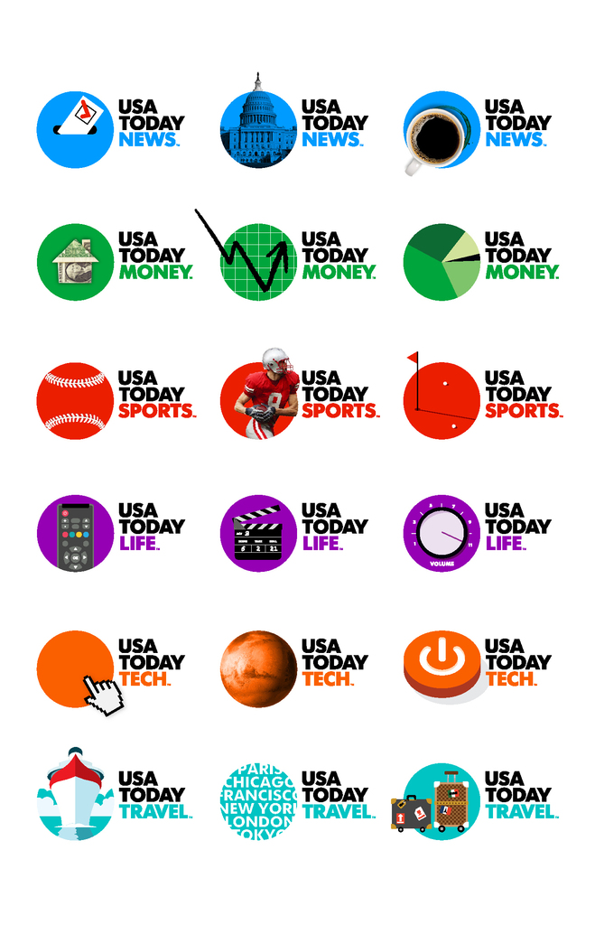
Take an example that explains the idea better than any definition. Imagine you are the CEO of USA Today, and the agency you hired to build your identity walks in after months of work and places a logo in front of you: a blue circle. Nothing more. What would you say? "Wow, stunning"? Or would you swallow a very different word? The same goes for seeing the National Geographic logo for the first time in your life: a hollow rectangle with a yellow border.
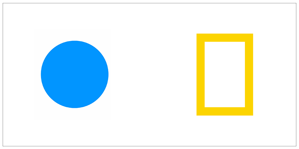
Neither the circle nor the rectangle carries enough beauty on its own to be judged before you see the whole story: how the circle becomes a sun, a ball, or a disc each day depending on the day's news, and how the yellow rectangle becomes a window onto the forest and the ocean. These logos were not designed to be beautiful. They were designed to be remembered, to be used, to live for decades, and to carry products that had not yet been invented. Nike's logo is not necessarily beautiful either, yet hundreds of thousands proudly wear it on their chests, because it is no longer a shape. It has become something people say about themselves.
In advertising, the same trap is even easier to see. If you go to a skilled artist and ask for an ad for your product without telling them the message, or the decision you want people to make after seeing it, they will hand you a dazzling piece that many will applaud, one that may even make the year's list of most creative ads. Then you call your sales director to ask about the impact, and they tell you: nothing worth mentioning. Hold on, my friend, before you collapse in regret: all you did was get a beautiful piece of work. You did not get an ad. The reverse is just as true. Many ads with no visual elegance at all have outsold every award winner, because they said the right thing to the right person at the right moment.
The other way is simple: start with the message, not the image. Bring in a copywriter to shape what you want people to understand and do, then go to the artist and ask them to translate that message into something beautiful. You will watch them change many things they would have done if left alone, because some elements have suddenly become more important than others.
The same applies to everything your eyes see without noticing. Fast-food chairs are plastic and uncomfortable on purpose: you paid little, and the restaurant wants you to eat and leave so someone else can sit down. In a fine restaurant, you pay for the comfortable chair and the long evening as part of the price of the dish. The color red, the lighting, the music, the shape of the chair: all of it is design doing a job before anyone asks whether it is beautiful.
A Logo Is Not Judged on the Day It Is Born
I wrote this post in May 2016, a few days after Instagram unveiled its new identity: the gradient icon that replaced the old brown camera. People were angry, many mocked it, and some said it looked like the logo of a cheap app. My comment back then was that a logo is not judged on the day it is born, because the story does not live in the icon alone, but in everything the company will ask of it in the years ahead: an app that turned black and white so the eye would land on the photos rather than the interface, a presence on every screen of every size, and products that did not exist yet.
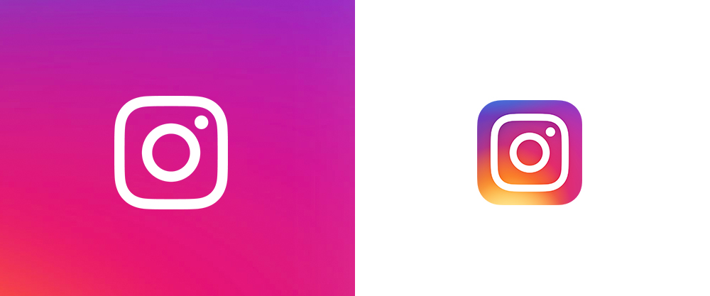
I return to these lines ten years later, and the icon is still in its place, with refinements hardly anyone notices, having carried Reels, Threads, and things that had no name in 2016.
The logo did not win because it was more beautiful than the old one. It won because it did its job.
Which brings me back to Abdullah's question, the one no one answered. No, beauty is not everything. Nor is it marginal: it is what makes people stop, look, and desire.
But in design, beauty is a servant, not a master.
The logo you find "ordinary" may truly be ordinary, or it may simply not have started doing what it was designed to do. The difference between the two never shows up in a tweet. It shows up in the experience people will live with it, long after they have forgotten the tweet.